Hugo Panonacle Artist Management unveils its new visual identity
 Blog
Blog Born from a dialogue between heritage and horizon, between rigor and intuition, this new artistic direction embodies the balance the agency stands for: positioning classical music within a bold, demanding modernity that remains open to interpretation.
Inspired by the rational architecture of the Bauhaus and the poetic forms of Kandinsky, who composed his paintings like abstract scores, this identity expresses an essential pursuit: that of a structured order that still leaves room for emotion. Like a fugue in which each voice finds its place, every graphic element contributes to an overall architecture conceived with precision. Typography acts as a clear melodic line, colours create harmonies, and empty spaces bring breath and rhythm.
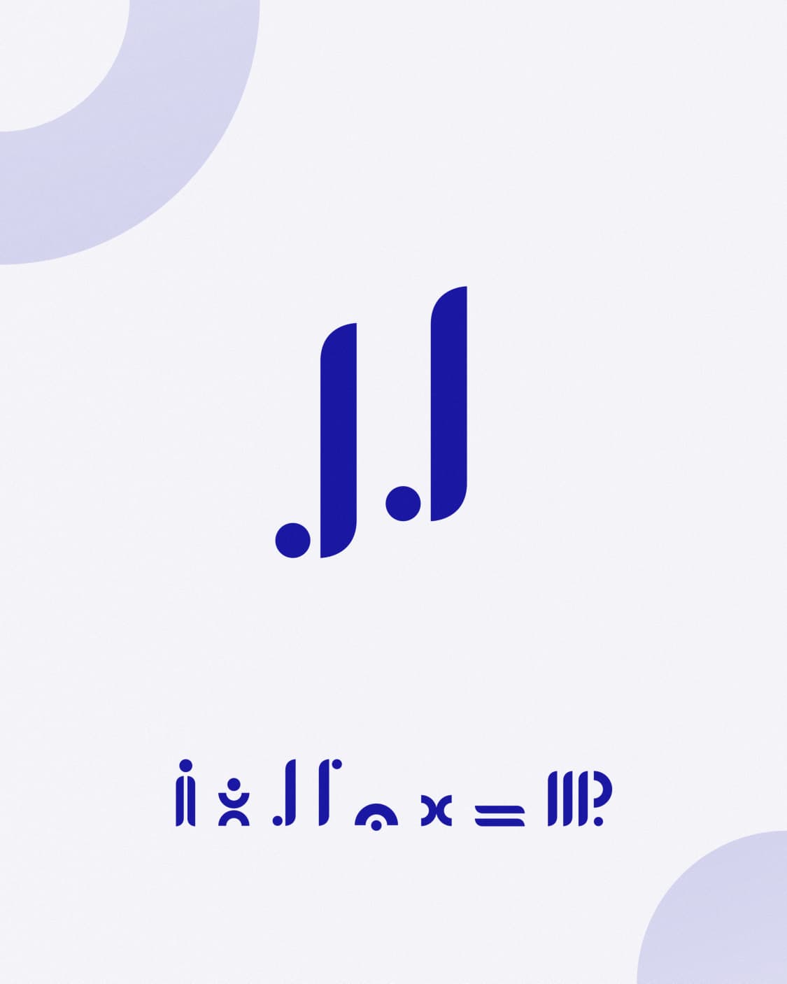
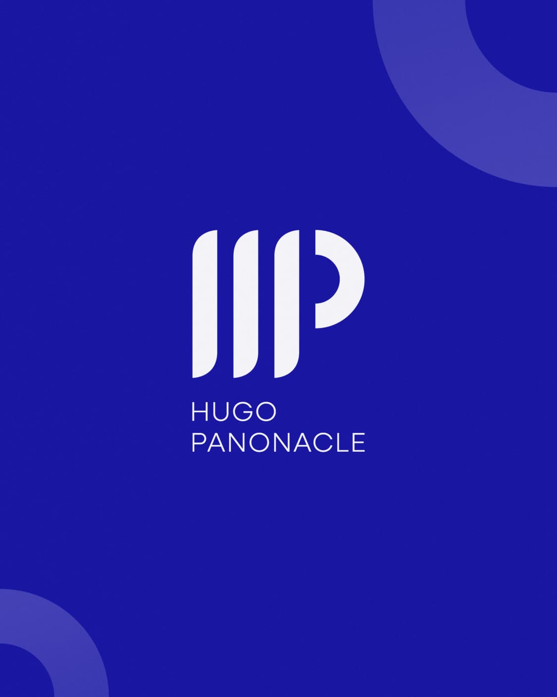
At the heart of this transformation, the logo synthesizes this vision. Built on a refined and balanced geometry, it combines stability and movement. Both monogram and symbol, it asserts a strong identity while remaining open, dynamic, and evolving.
Rolled out across all media, from business cards to the website, from mugs to tote bags, this new identity now accompanies the agency in all its expressions. It asserts a clear and contemporary visual coherence, faithful to its DNA and resolutely oriented toward the future.
Clarity, movement, and boldness… down to the smallest details.